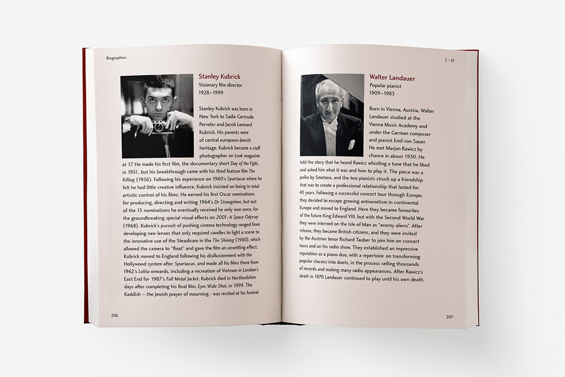
Constance Spry
Constance Spry was the most sought after florist in late 1920s and 30s high society, providing flowers for aristocratic weddings and even managing the design for the coronation of Elizabeth II in 1953. This exhibition explores Spry’s exceptional life and long career, including photographs, documents and personal items from her archive at the RHS Library.
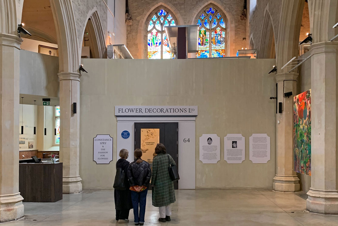
Known for her bold, forward-thinking approach to floral design. She often mixed traditional flowers with unusual plants such as pussy willow and kale, creating unusual modern arrangements.
Classic Science Fiction Stamps
British authors have been at the forefront of science fiction writing since 1818 when Mary Shelley penned what is arguably the first science fiction novel Frankenstein; or, The Modern Prometheus.
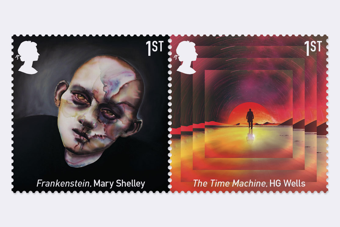
With such a vast and complete mix of ideas across the six novels our first task was to decide on the key theme or plot point of each text and decide on the best way to illustrate that on a small canvas. To do this we commissioned six artists and illustrators for the collection, with each stamp featuring a scene from a book that marked a “key evolutionary moment” for the genre.
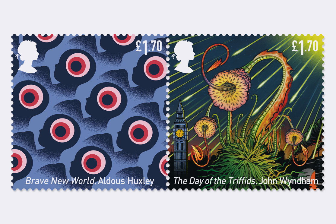
As well as a celebration of British science fiction the release of the collection in 2021 marks the 75th anniversary of the death of famed sci-fi writer H.G. Wells, as well as the 70th anniversary of the publication of John Wyndham’s The Day of the Triffids.
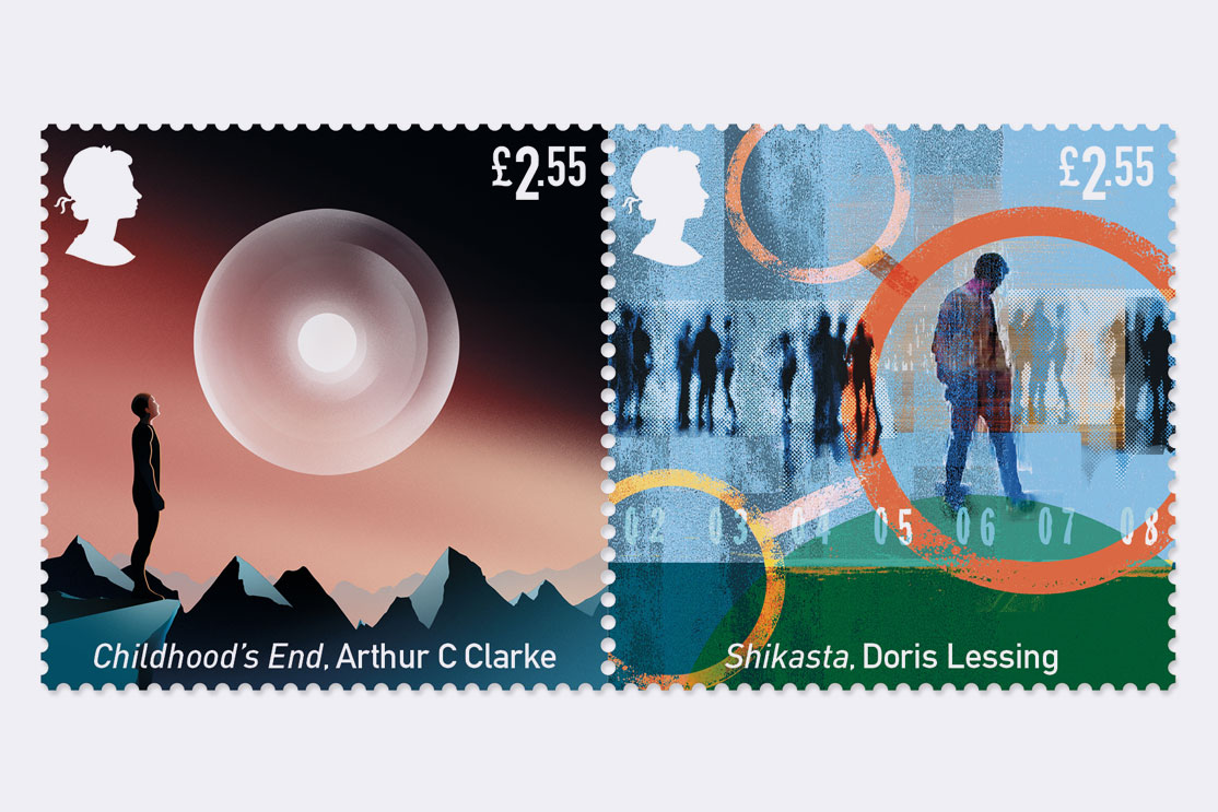
The full set includes Frankenstein by Mary Shelley illustrated by Sabina Sinko; The Time Machine by HG Wells illustrated by Francisco Rodriguez; Brave New World by Aldous Huxley illustrated by Thomas Danthony; The Day Of The Triffids by John Wyndham illustrated by Mick Brownfield; Childhood’s End by Arthur C Clarke illustrated by Matt Murphy and Shikasta by Doris Lessing illustrated by Sarah Jones.
…the latest batch [of stamps] from the Royal Mail has me
wanting to send letters to every corner of the universe.
mashable.com
Random Spectacular
Random Spectacular 17. Journal design for St Jude’s gallery featuring illustrations and written pieces from artists and illustrators including Jonny Hannah, Jake Tilson, Rob Ryan, Maggie Hambling, Mark Hearld, Jeff Fisher and Ian Beck. The cover image is based on a wood engraving by Eric Ravilious.
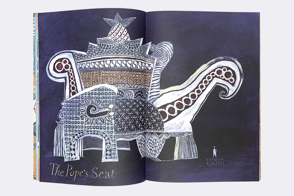
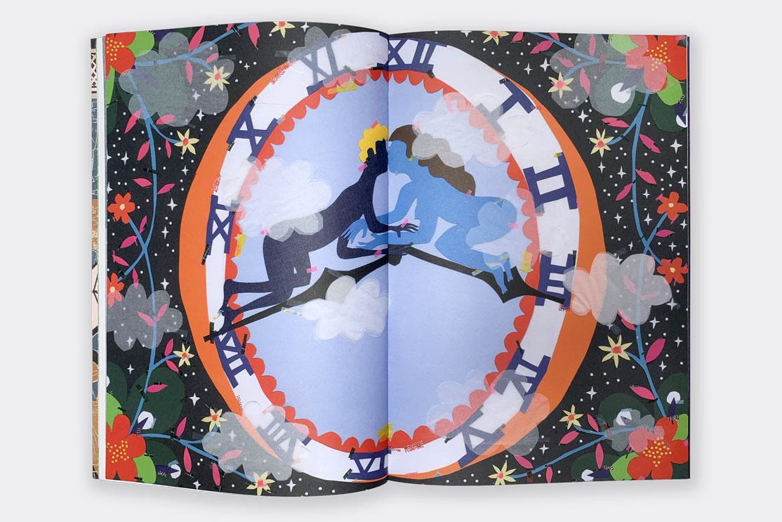
Designed to accompany a collaborative exhibition at the Fry Art Gallery the journal contains contributions and responses to work in their collection.
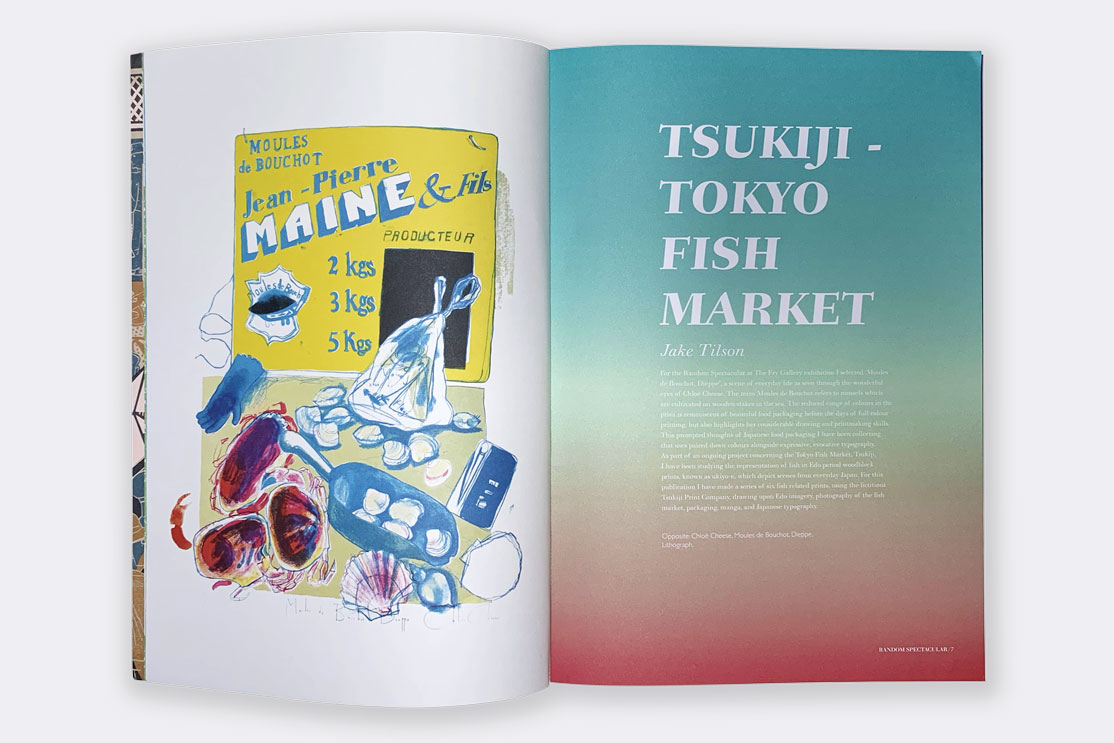
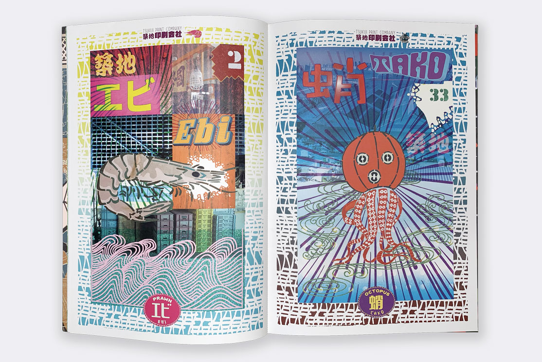
All profits from the journal were donated to the Fry Art Gallery Building Fund.
Derek Jarman
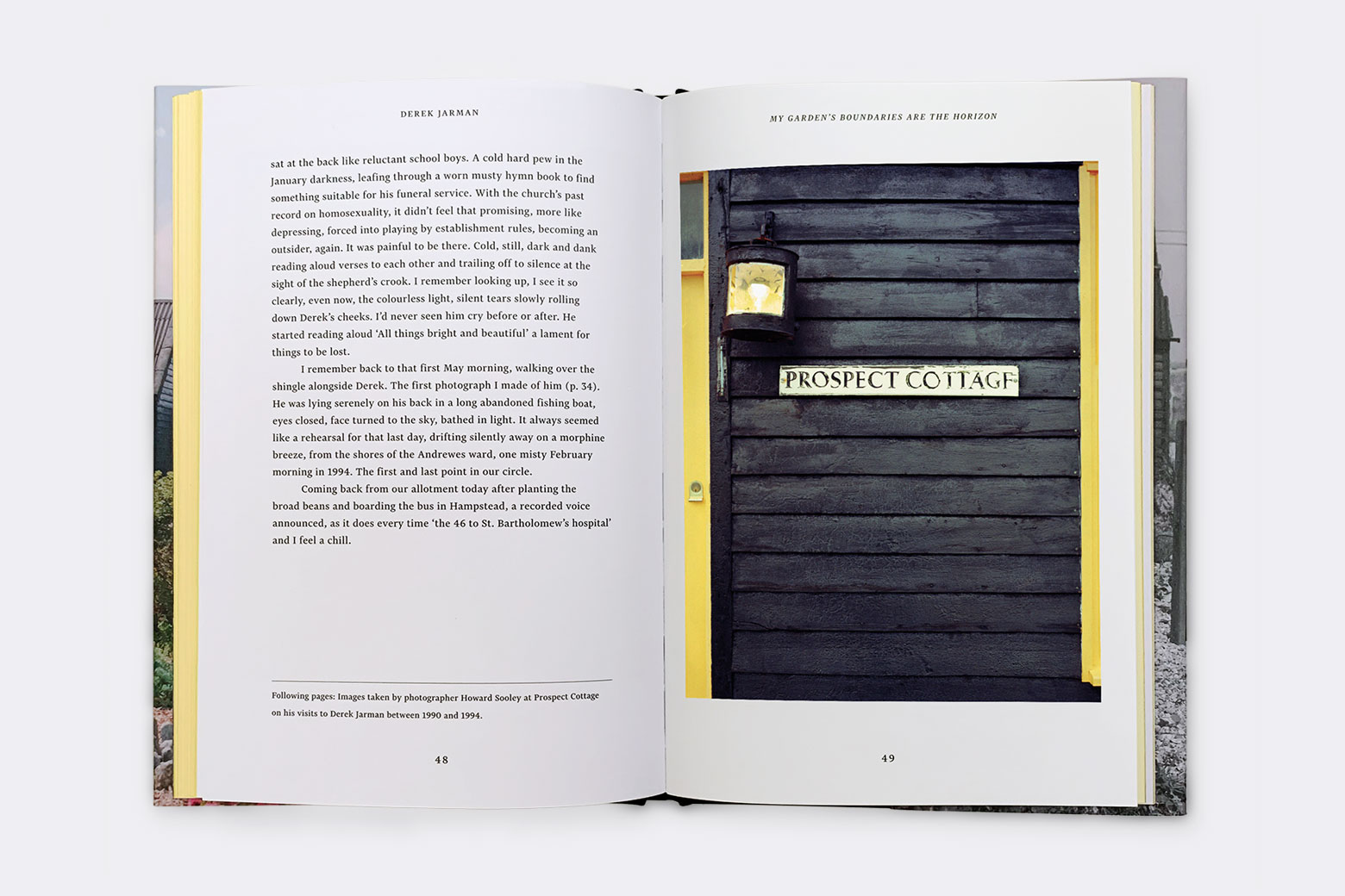
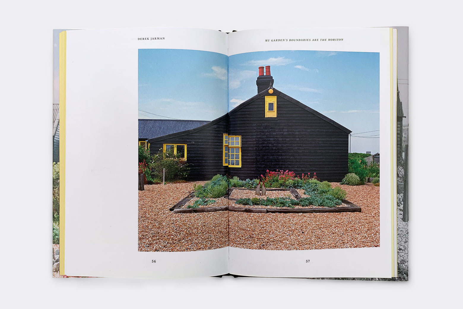
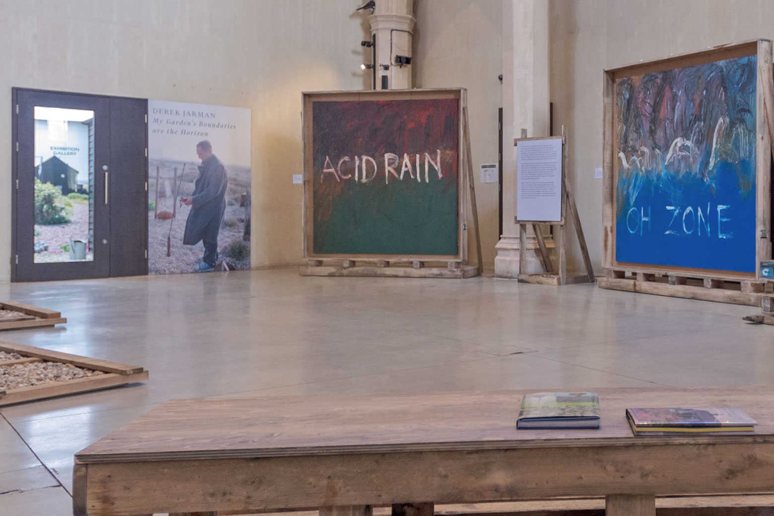
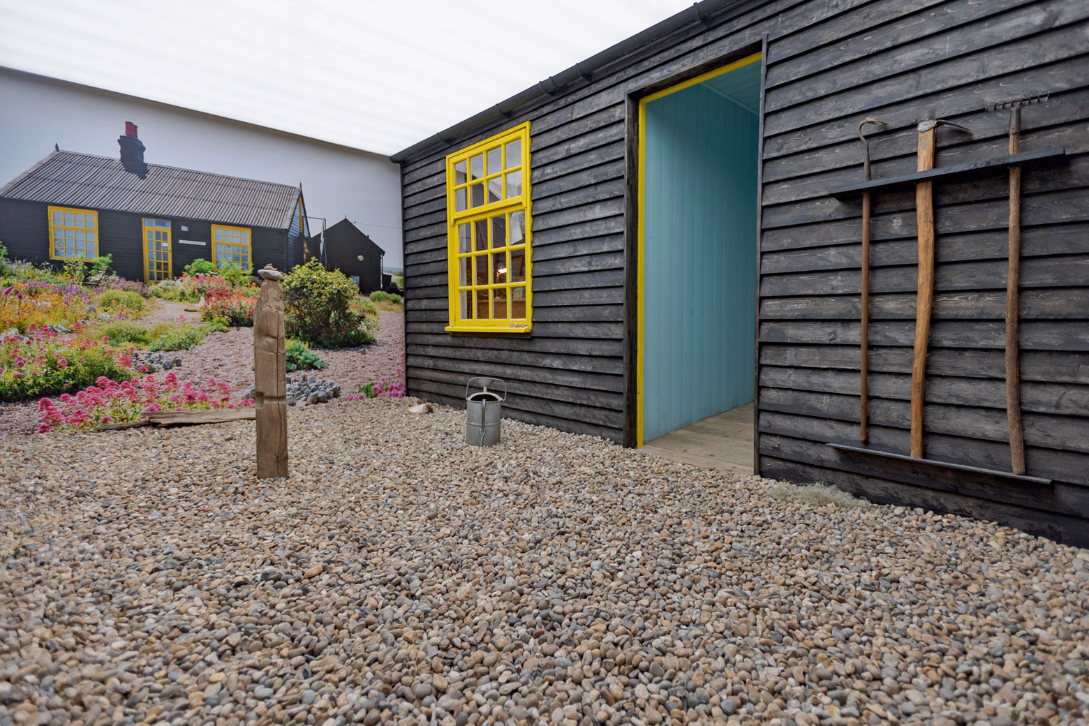
In the 1980s filmmaker and artist Derek Jarman bought a derelict fisherman’s hut on the desolate single beach of Dungeness. The house was called Prospect Cottage and it was in the wild garden he grew there that Jarman found solace from the HIV/AIDS diagnosis that would eventually claim his life in 1994. My Garden’s Boundaries are the Horizon, at the the Garden Museum, is the first exhibition to focus on Jarman’s love of gardening and his passion for the natural world. The museum asked us to design a book to accompany the sensitive and inspiring exhibition.
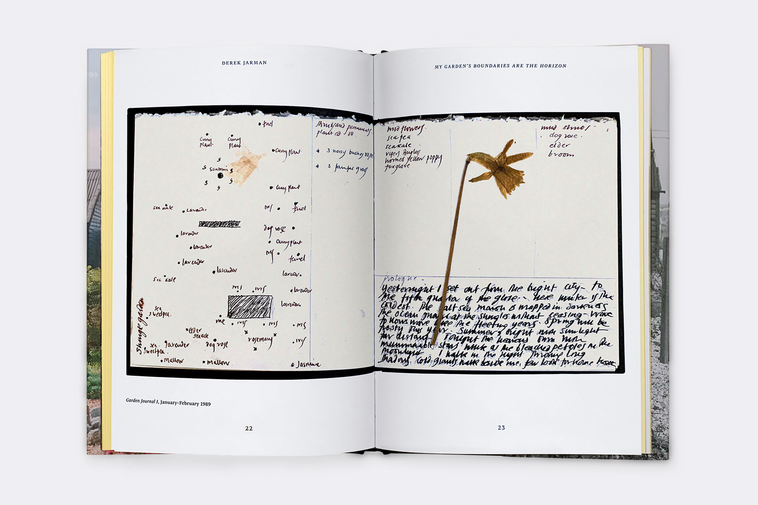
The book is illustrated with Jarman’s personal photos of the garden and childhood, film stills and artworks. Essays and articles intersperse the imagery, including a very personal reminiscence of his time with Jarman by photographer Howard Sooley. To accompany Sooley’s essay we selected a very special set of his photographs, printed on photographic paper stock and inserted into text. Underneath the jacket, the debossed rules and type on the cover echo the tar weatherproofed timber fisherman’s hut. The edges of the book are coloured to match the doors and windows of the cottage that Jarman painted in striking yellow.
We also worked with theatre designer Jeremy Herbert on the exhibition which includes sculpture, paintings and film work from the Jarman archives. The entrance gives the visitor the opportunity to walk across the shingle of Dungeness into a replica of Prospect Cottage. The exhibition was named Exhibition of the Year at the 2021 Museum & Heritage Awards.
My Garden’s Boundaries are the Horizon is the fourth in a series of books and exhibitions for the Garden Museum.
The Jarman catalogue has met with such a wonderful reaction.
Exceptional sales, but I have lost count of the compliments.
Christopher Woodward, Director, The Garden Museum
David Fickling Books
Having already designed several editions of Harry Potter for Bloomsbury Publishing when David Fickling Books asked us to design a book of essays for Philip Pullman we jumped at the chance to add another of our favourite young adult authors to our list. This collection of 32 talks, published articles, and prefaces written between 1997 and 2014 addresses “the business of the storyteller”. Inspiration for the cover is taken from the title Daemon Voices; Pullman has often stated that his daemon, or the physical manifestation of the human soul in the form of an animal, as described inPullman’s in His Dark Materials trilogy, is a raven.
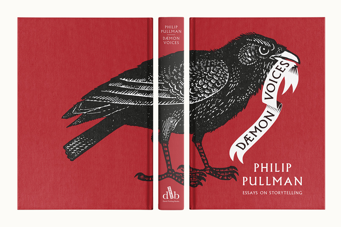
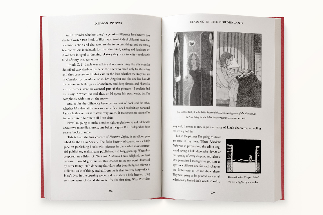
We commissioned illustrator and wood engraver John Lawrence to create a special wood engraving of Philip’s daemon for use on the cover. Working with printers Clays we organised print test to enable us to achieve the best result for printing specification directly to the cloth bound case. We also worked directly with Philip and his editors to design the text pages of the book, keeping the feeling of the original talks and articles but updating them into a book format.
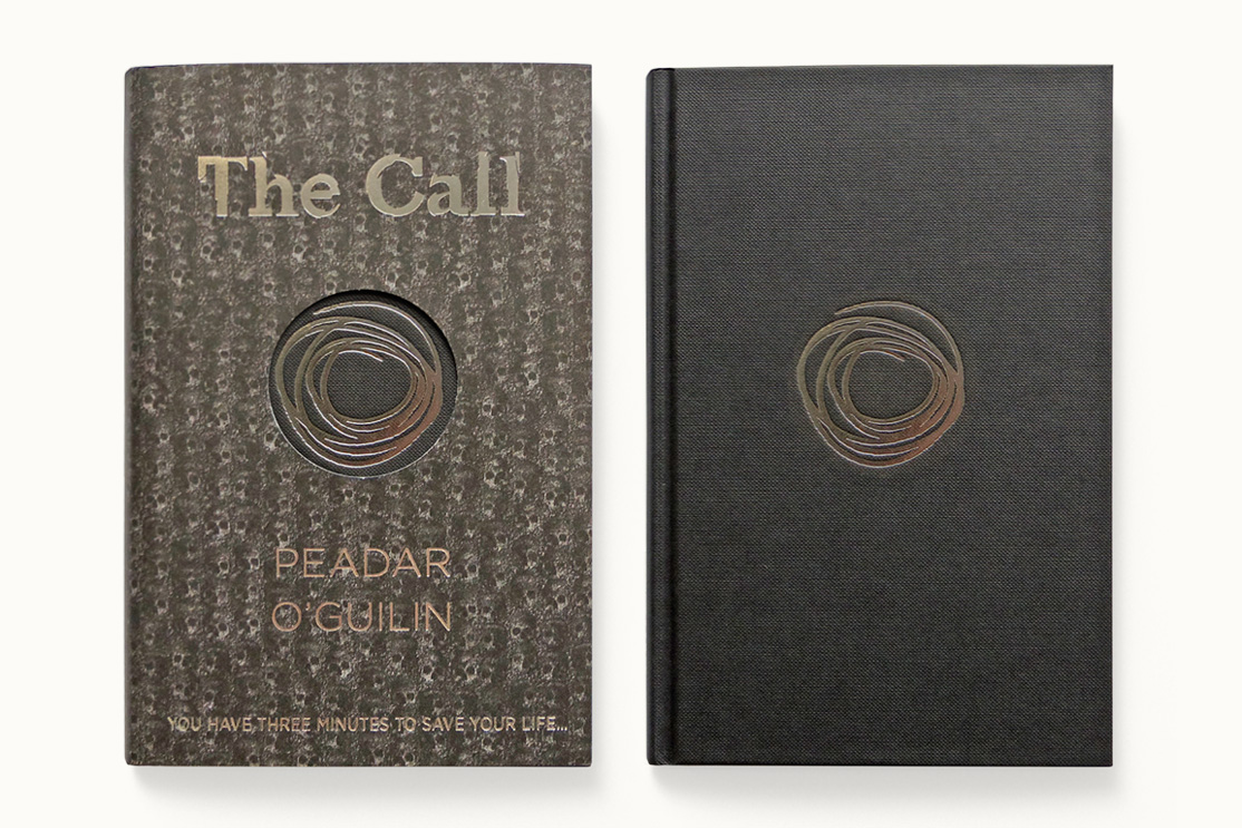
It is said that sometimes you have to suffer for your art, or in this case scare yourself rigid, and Peadar O’Guilin’s The Call is pretty scary! Desbcribed by author Danielle Vega as “a must-read for anyone who’s been sleeping too well at night” we made this cover as intense as the story. A swirling silver vortex leaves you falling into a world below where the fractured bones of previous victims sink into the mud…
Lovely cover. Worth the price on its own.
Philip Pullman
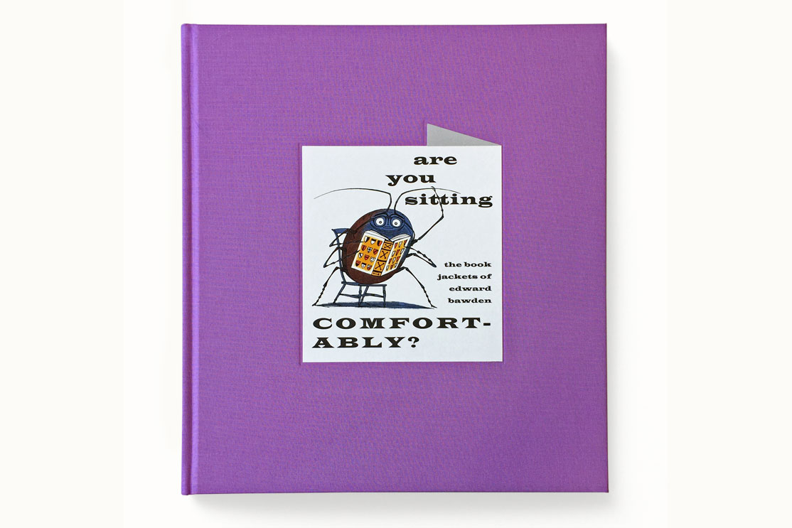
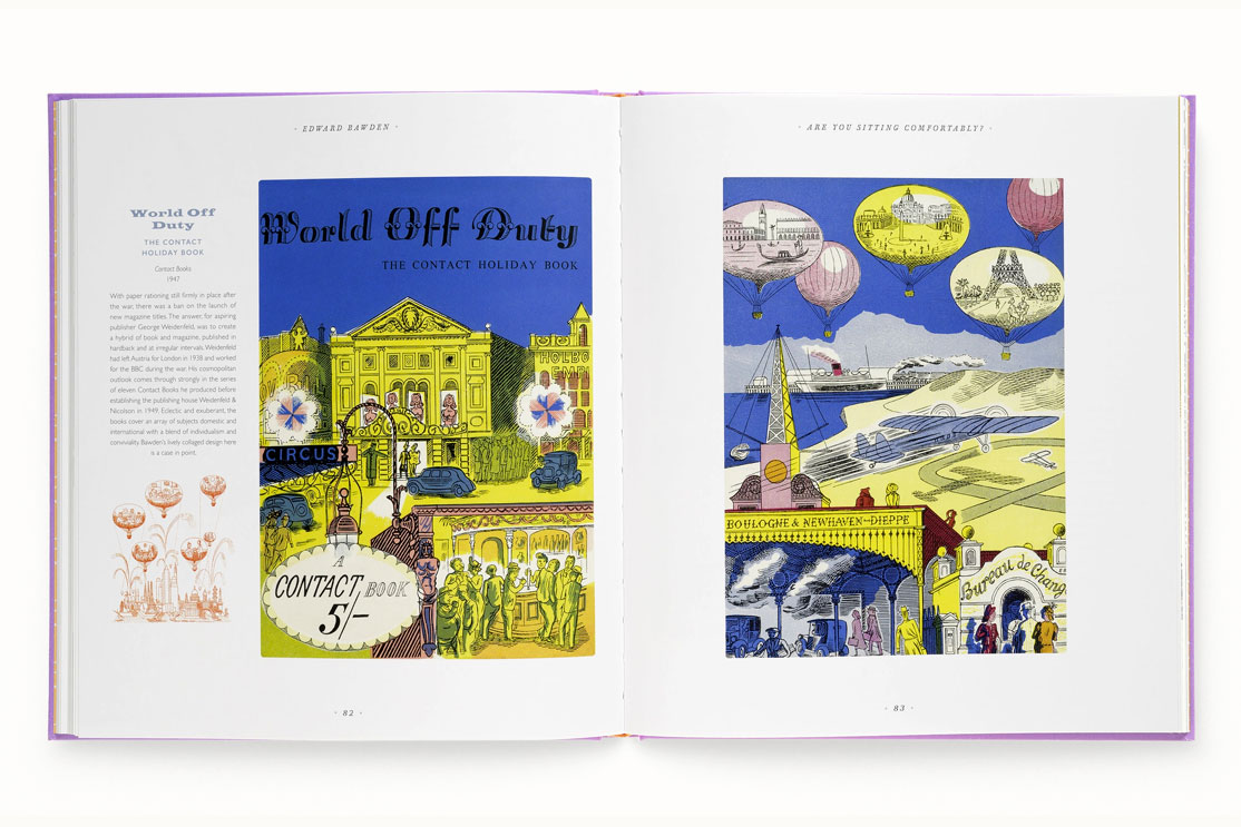
Mainstone Press
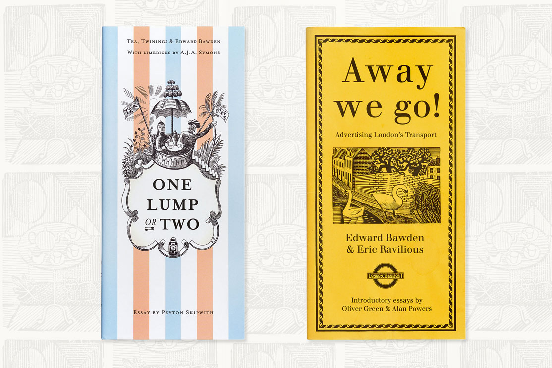
The Mainstone Press is an independent publisher based in Norfolk. We were approached by the owner Tim Mainstone about 10 years ago to help design and produce his first book, Away We Go!, which features the black and white illustrations produced for London Transport’s Press Advertising Department in the 1920s and 30s.
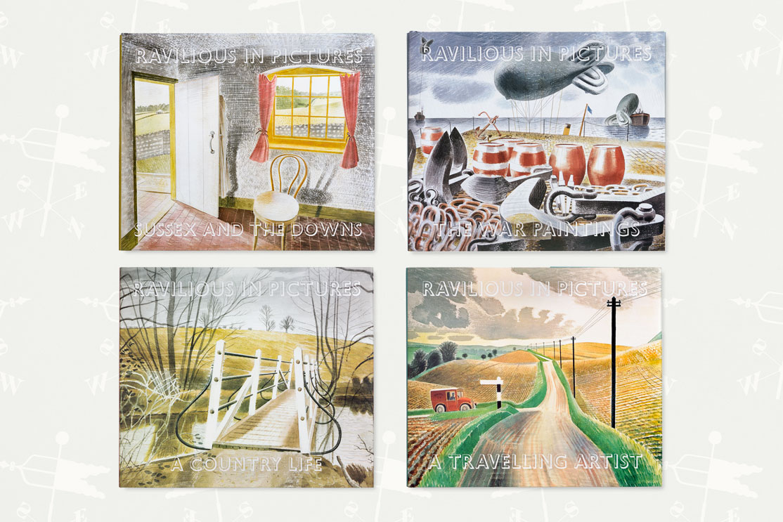
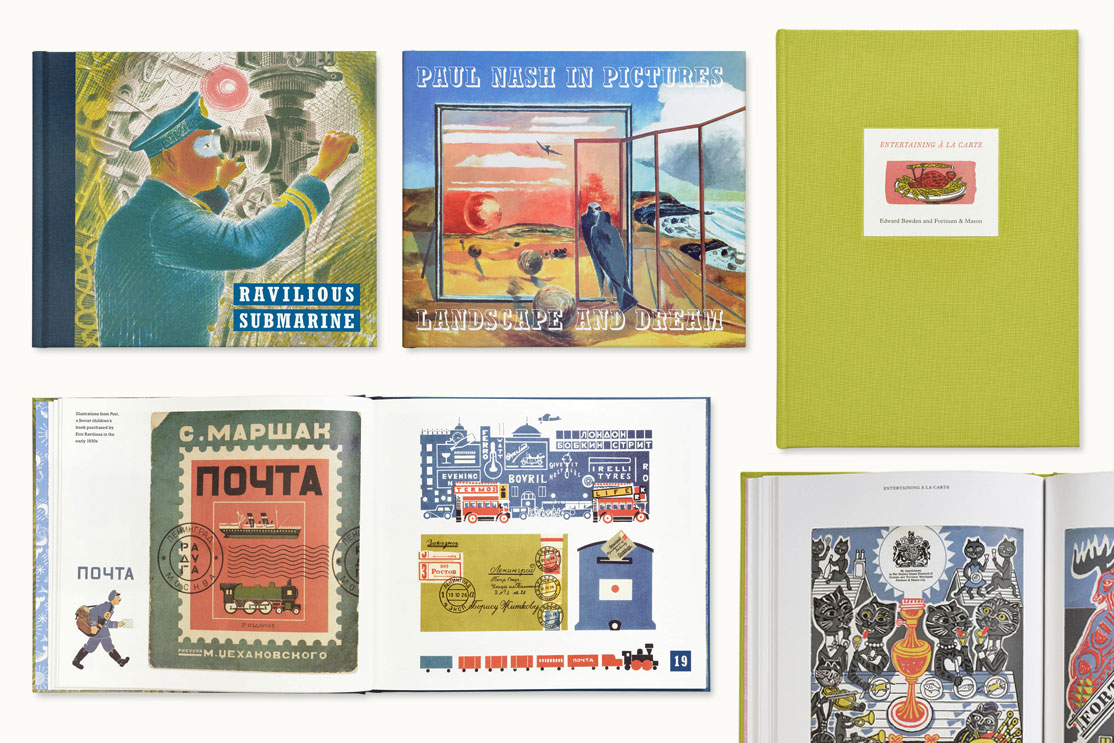
Since then we’ve gone on to produce 10 more books together including the incredibly popular Ravilious in Pictures series which spans four books and was described as ‘alluring’ by The Guardian’s non-fiction editor Paul Laity.
Our latest book Are you Sitting Comfortably has been receiving excellent reviews in publications including The Guardian, Eye magazine and Standpoint magazine, the latter calling the it ‘superb’. The book has also been shortlisted in the 2018 British Book Design Awards Art Monograph category.
 A joy to work with. Webb and Webb totally understand what makes good design –
innovation, inspiration and imagination – all of which they have in abundance!
Tim Mainstone, Mainstone Press
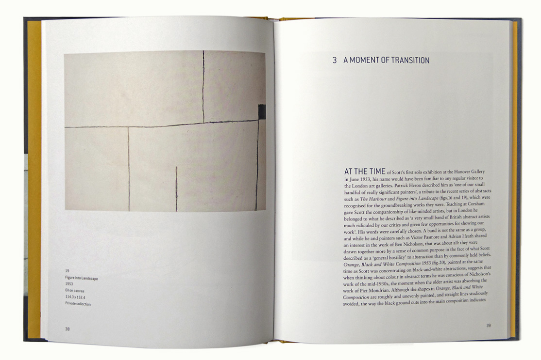
Tate British Artists
The Tate British Artists series spans 13 books on artists including Lucian Freud, J.M.W. Turner, Francis Bacon and Barbara Hepworth. Originally, they were a series of glossy black covered paperbacks and our job was to make them a more desirable and collectable series.
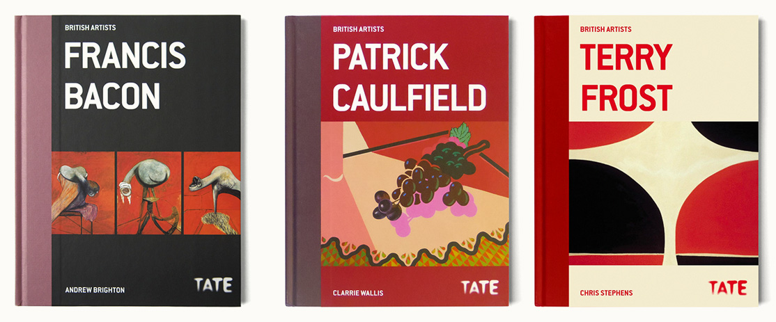
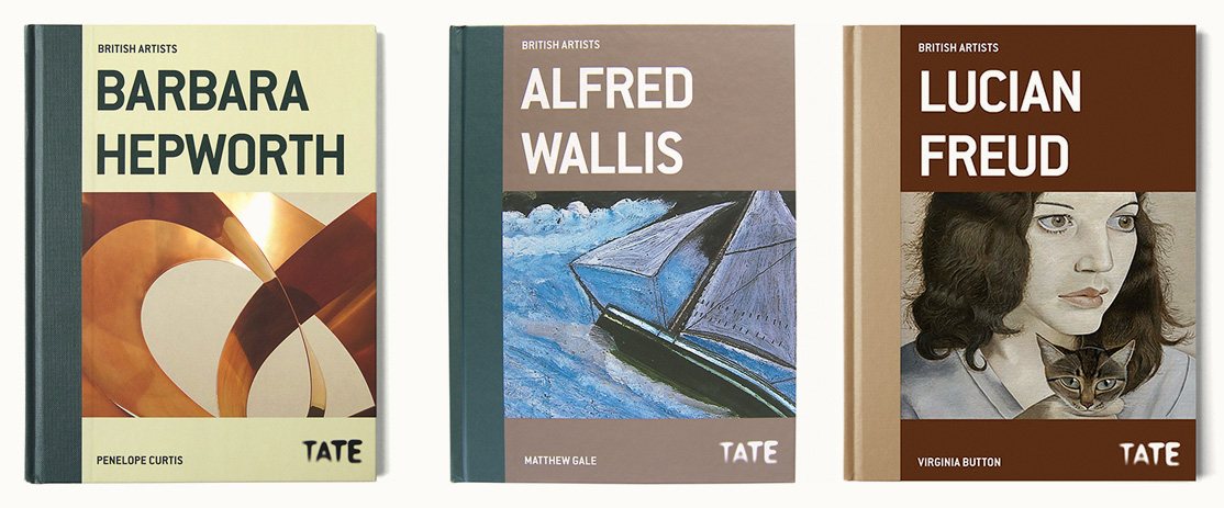
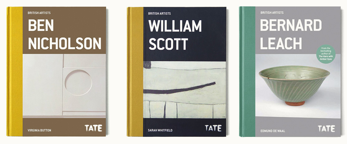
Our solution was to turn them into a hardback series with a cloth binding and colour scheme to complement the individual artist’s palette. Inside the images are given more room to breathe and the typography is fresh and modern.
Nominated for the German Design Award Best Rebrand/Redesign
German Design Council
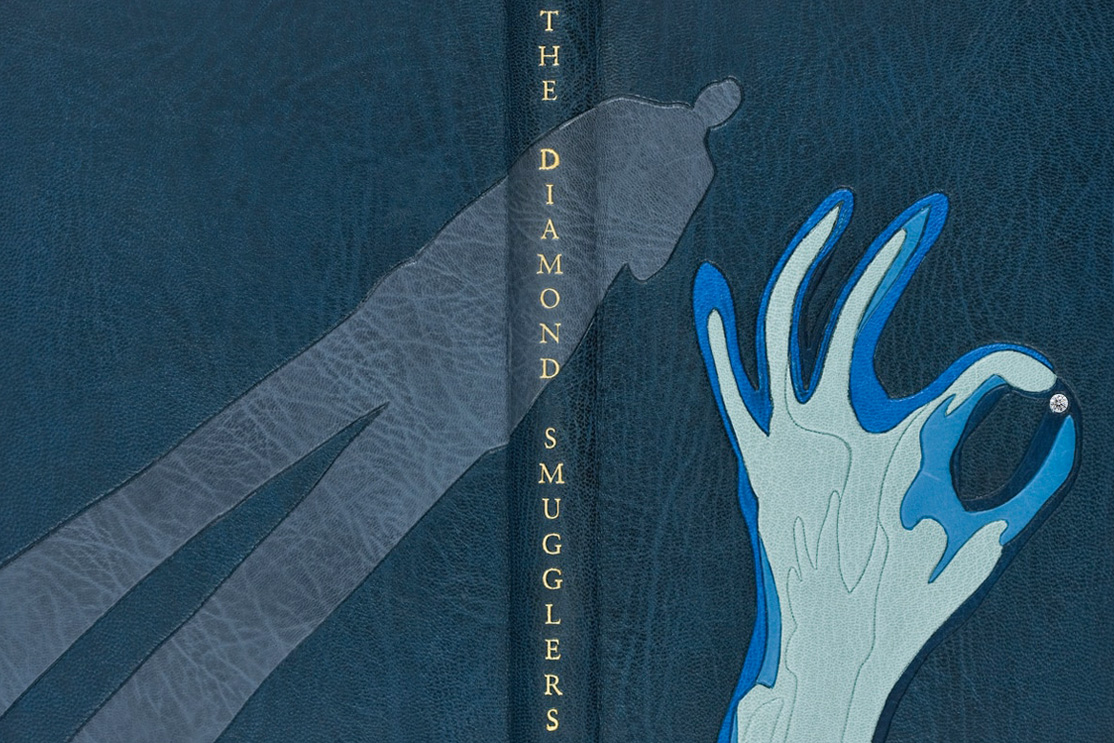
The Complete Works of Ian Fleming
Design and illustration for Fleming’s complete works, the 18 book set includes the 14 volumes of the James Bond novels, the non-fiction volumes The Diamond Smugglers and Thrilling Cities plus the children’s story Chitty-Chitty-Bang-Bang. The final volume, entitled Talk of the Devil, contains rarely seen material including two stories, some of which is unpublished. The leather designs – which reflect elements of the original text – are crafted in goatskin and feature exotic details such as a diamond, crystals or a piece of eight.
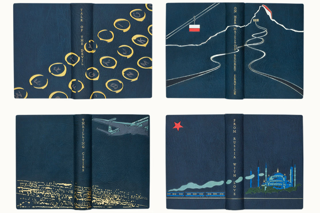
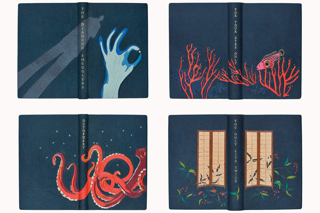
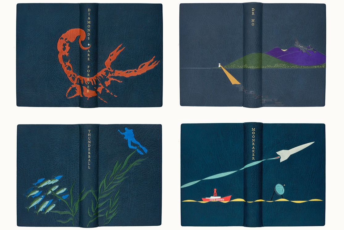
Like most book covers we design we start by reading the book… from there we produced illustrations drawn by hand and then digitised into cutting templates for the binders Shepherds, Sangorski & Sutcliffe to reproduce in leather. The gold detailing and titles are also hand-stamped in 22 carat gold leaf. Little wonder then that this set retails at £14,000 and a set lettered M sold for £91,250 at Christie’s 50 Years of James Bond auction.
The first of its kind, this limited edition is so lavish
that Bond himself would be impressed.
Financial Times
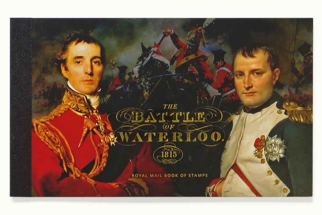
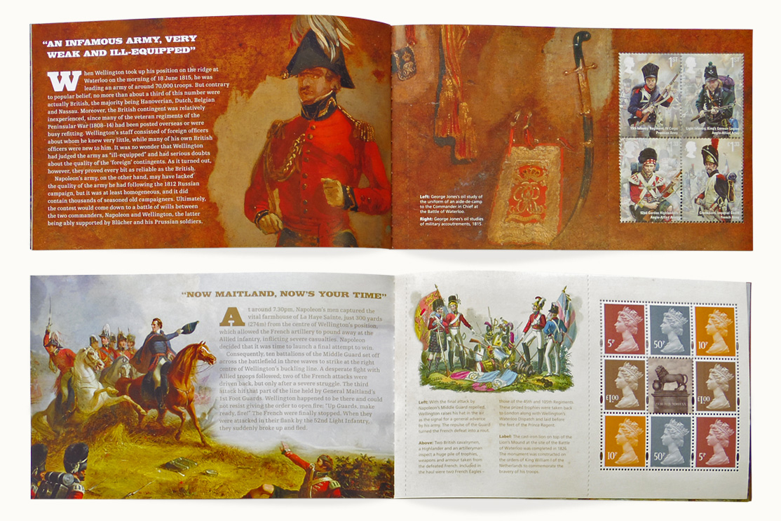
Royal Mail ‘The Battle of Waterloo’
Stamp and Prestige Stamp Book design to commemorate the 200th anniversary of the Battle of Waterloo. Royal Mail asked us to depict the uniforms worn at the battle.
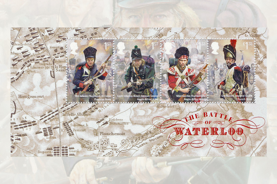
To avoid ending up with a stuffy set of stamps that looked like a kit inspection checklist we commissioned military artist Chris Collingwood to paint the soldiers fighting in key moments in the battle, whilst keeping the uniforms incredibly realistic. Each painting is about 1m high and has been photographed, reduced and the foreground soldier separated from its background and the background faded.
We also produced a Prestige Stamp Book written by military historian and author Ian Fletcher, which tells a timeline story of the battle set against art and ephemera from the period.
As Chairman of Waterloo 200, the charity established to commemorate the battle of Waterloo, I would like to say how pleased we are with the Waterloo stamps.They are an excellent reminder of an important moment in European history.
Sir Evelyn Webb-Carter, Chairman of Waterloo 200
Oliver Laws
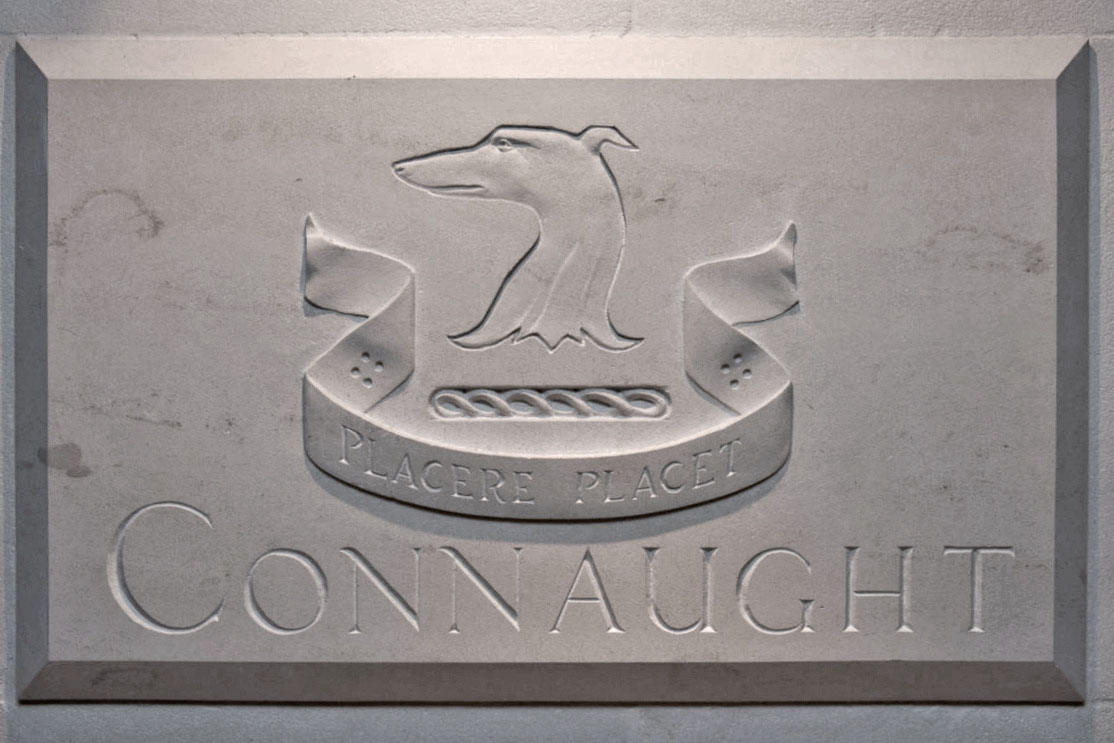
Oliver Laws are an interior and architectural design company working internationally on a range of projects from listed country houses and hotels such as Claridge’s and The Connaught, to the state rooms at Number 10 Downing Street.

The fully responsive website is designed to be managed in-house whilst the stationery and print work uses more traditional methods such as letterpress and hand-painted page edges on stationery.

The Connaught Hotel
Working alongside our interior design client Oliver Laws, we were tasked with creating a complete wayfinding scheme for The Connaught Hotel’s £70 million refit. Taking cues from their famous ‘American Bar’ with its polished zinc countertop, textured walls in platinum silver leaf and the overall paint scheme of Farrow & Ball ‘White Tie’, we produced hand-cast ornate polished zinc frames with engraving infilled in enamel to match the paintwork.
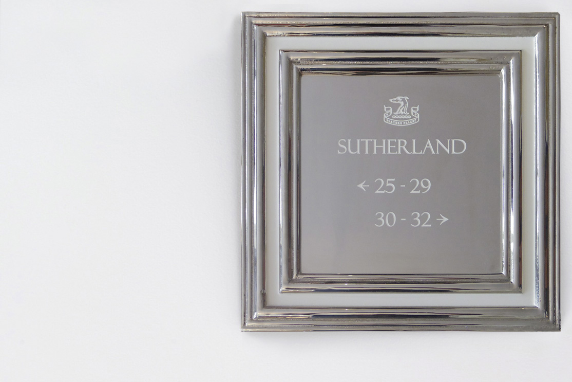
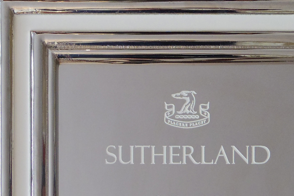
We also created a bespoke typeface based on the 1934 Monotype font Felix Titling, which was used throughout the hotel and on branding and packaging.
The Connaught is simply a hotel where luxe out luxes itself.
Evening Standard
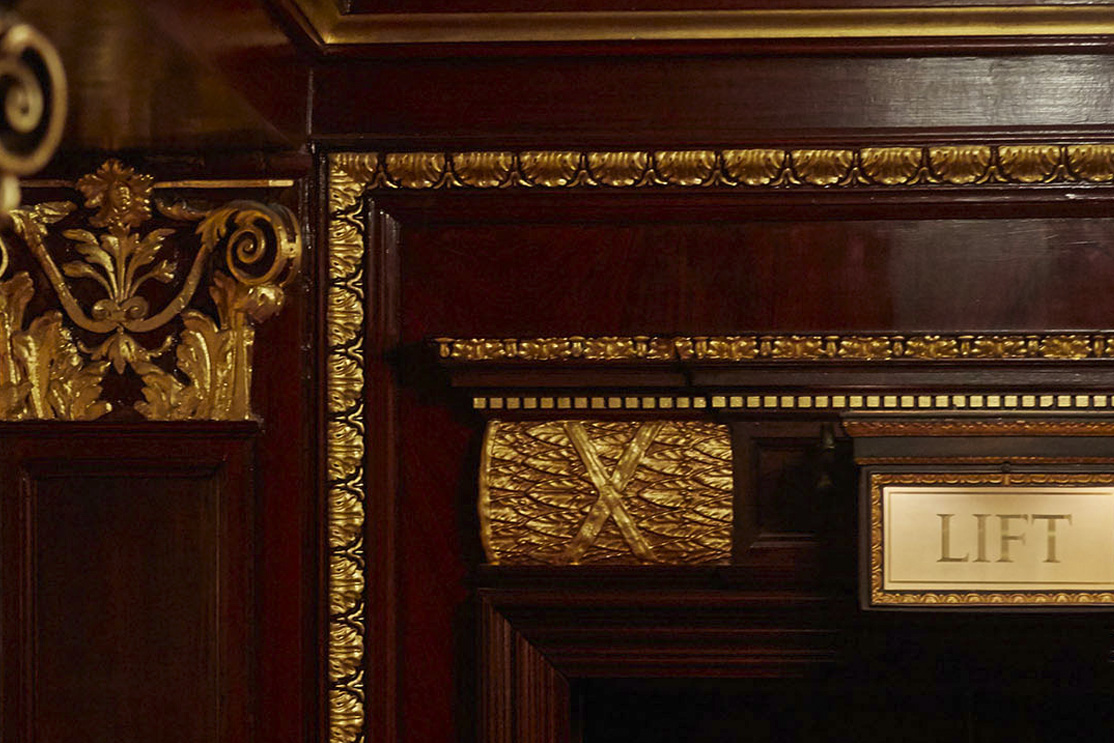
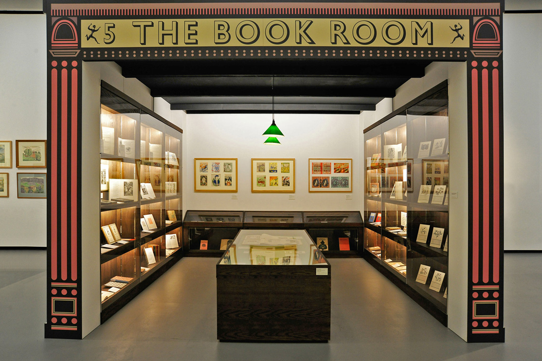
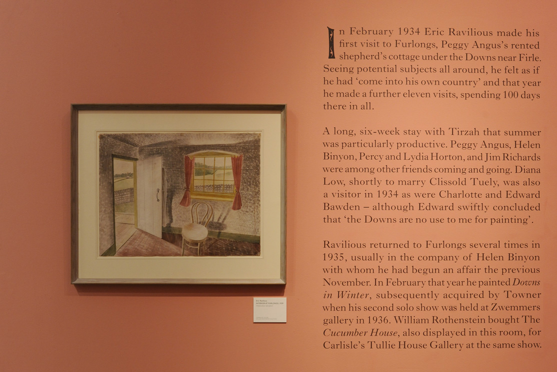
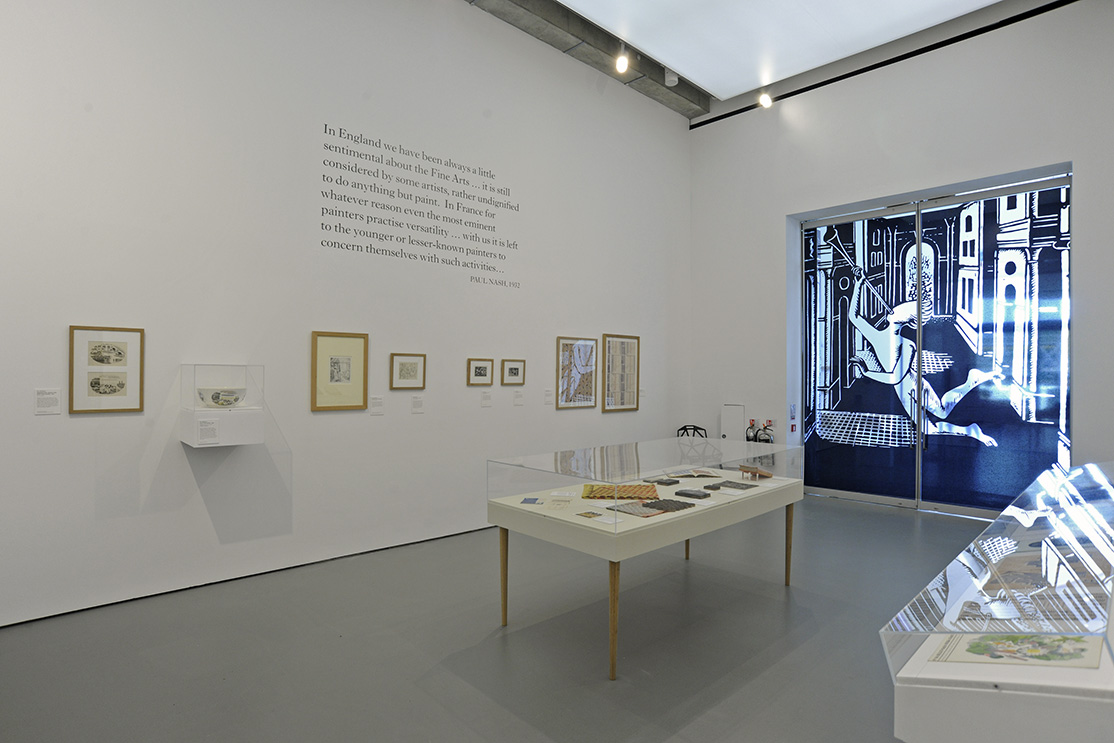
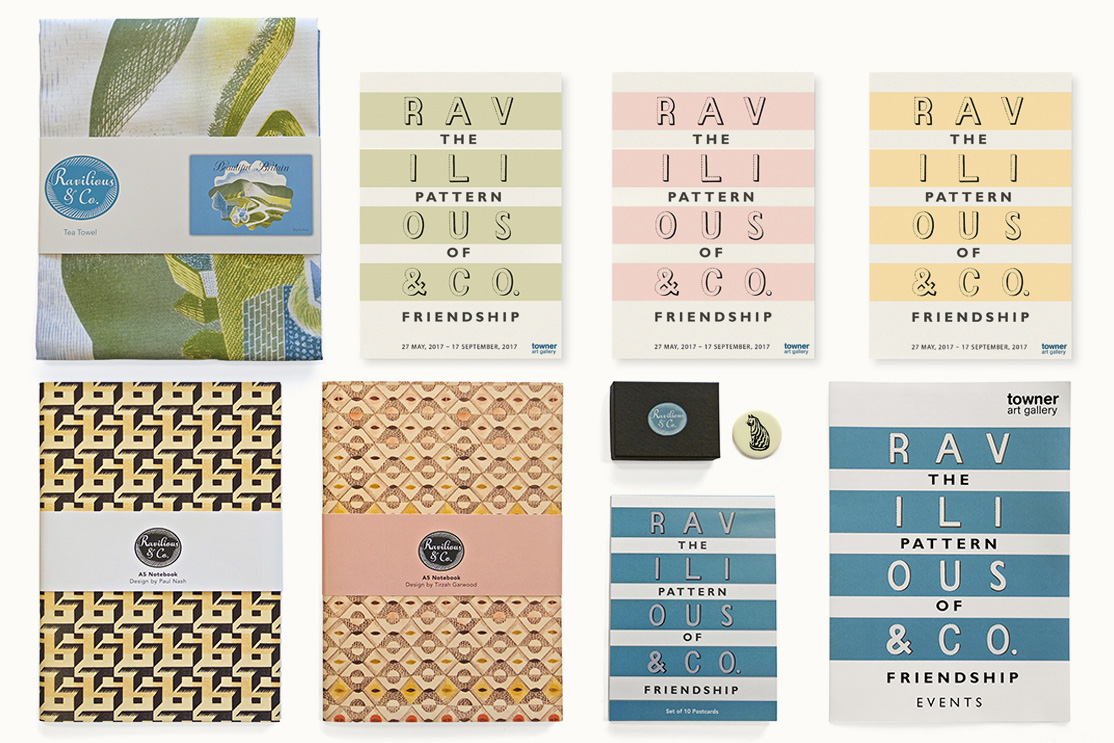
Ravilious & Co.
To help commemorate the 75th anniversary of the death of artist Eric Ravilious, the Towner Art Gallery in Eastbourne asked us to design the exhibition Ravilious & Co. Working with the Towner’s curatorial team we split the exhibition space into areas, creating set pieces such as a Corinthian columned entrance way and a ‘bookshop’ to display the large number of book illustrations and covers on show. A colour scheme and typography sensitive to the material on display, as well as a bespoke headline typeface added to the feel.
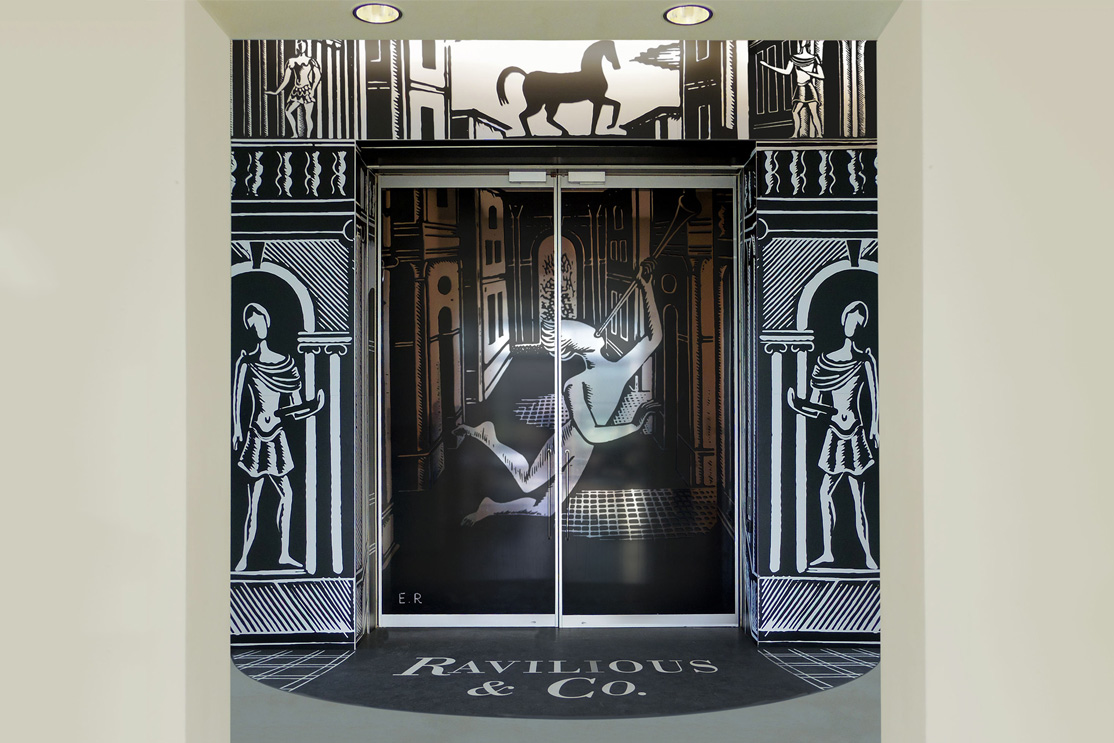
Visitors enter by way of a large blow-up of Ravilious’s joyfully Italianate engraving
for the dust jacket of Osbert Sitwell’s Winters of Content, to find themselves in a
sequence of forget-me-not blue, primrose-yellow and muted salmon pink spaces…
The exhibition is a true delight.
Country Life
Our working relationship with Webb & Webb has been extremely positive
and the curatorial team have found them both flexible and available when needed.
All the timelines agreed at the outset have been met and proposed solutions for difficult
issues have been evolved iteratively at the required pace.
Andy Friend, Curator, Towner Art Gallery
Jewish Lives
The Jewish Lives project tells the stories of the remarkable Jewish men and women who helped to shape British society. It is led by Jewish Museum London with the support of the Kirsh Charitable Foundation. Originally we were brought on board to create a website to launch with a few hundred entries; however, this quickly morphed into a much larger project encompassing an interactive online engagement platform, a six-part book series and visual display at the museum.
We initially commissioned NY based illustrator Laurie Rosenwald to create covers for the book series, with each book focussing on the contributions of individual Jews to a different sector, including arts, public service and commerce. However, the results were so perfect that we animated them and used them as introductory screens on the website and as stills throughout. This brought a sense of ‘branding’ and a theme across both digital and print platforms.
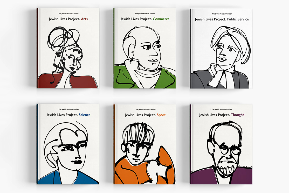
The website was shortlisted at The Lovie Awards 2018, which honours the Best of the European Internet. The book series, which is being used by the museum as a fundraising device to send out to prominent sponsors, has so far raised over six figures.
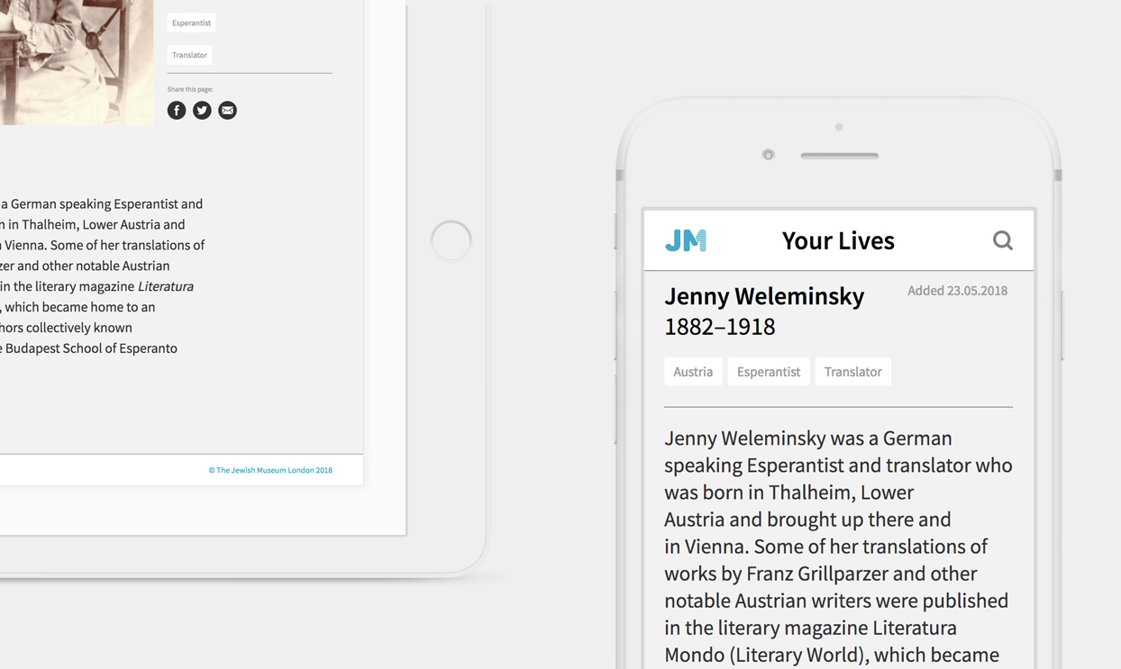
Finally, to further public engagement with the museum, we developed the Your Lives website. Here members of the public can commemorate British Jews who have made a personal impact on their lives.
Webb & Webb was an excellent design practice to work with
on the creation of the Jewish Lives Project. They delivered intuitive,
user-friendly design and found creative solutions when the project
expanded beyond what was originally briefed.
David Bownes, Project Director, Jewish Museum London
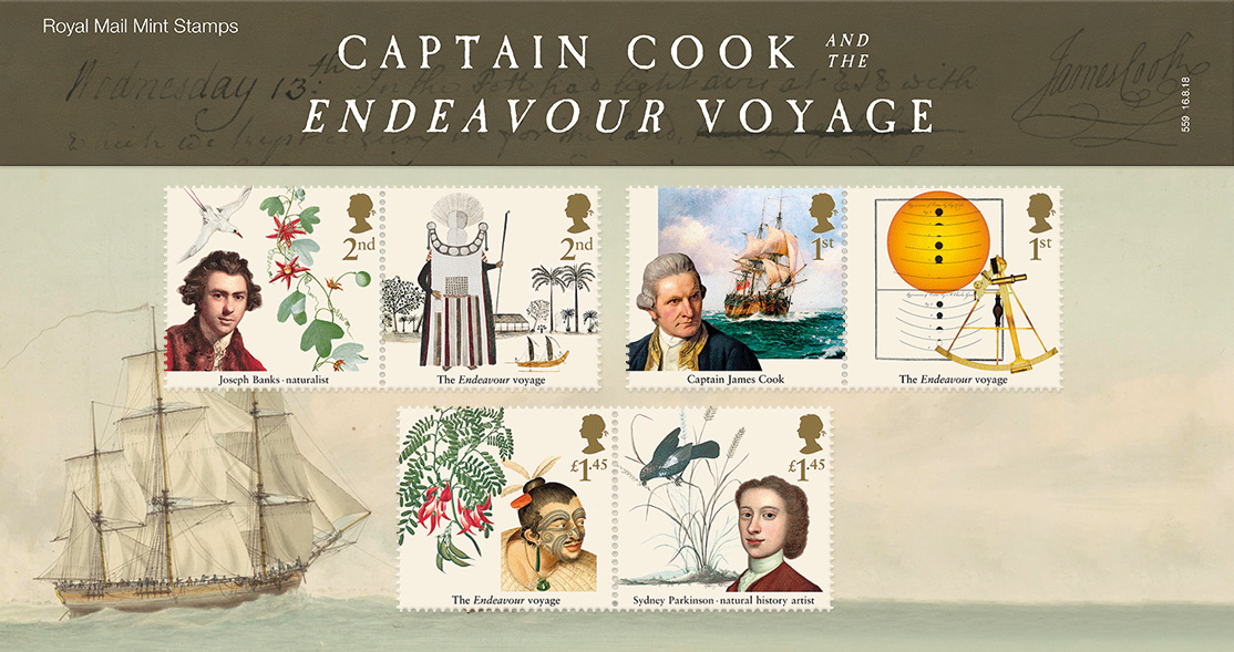
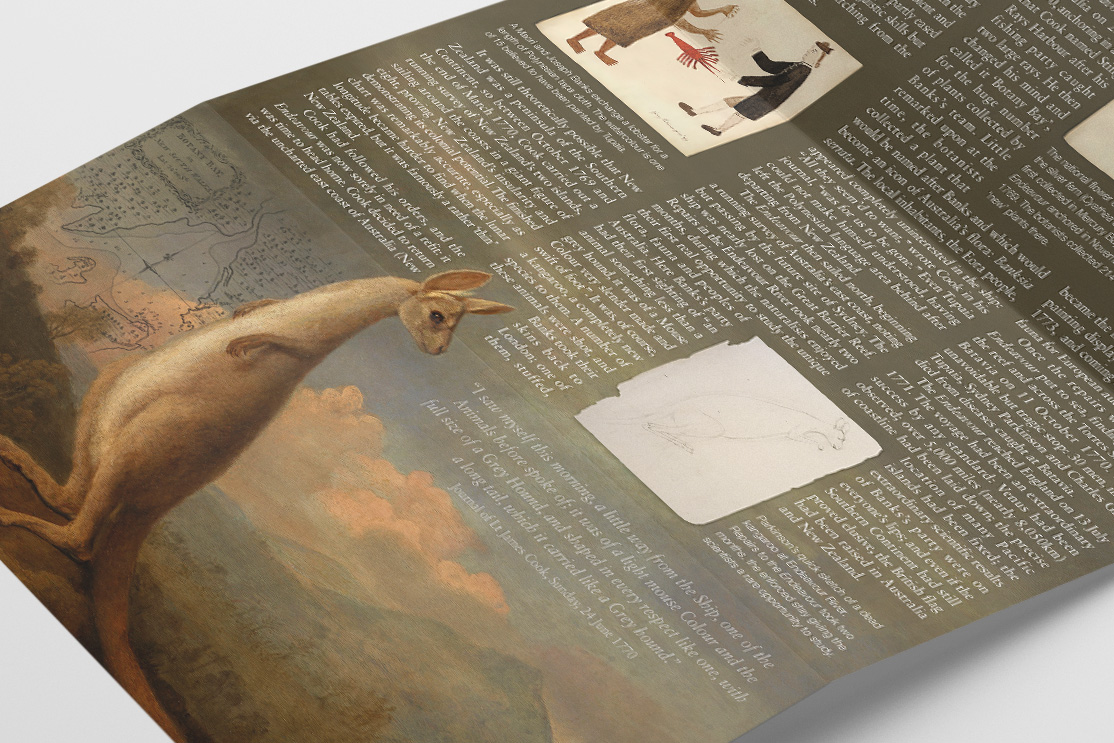
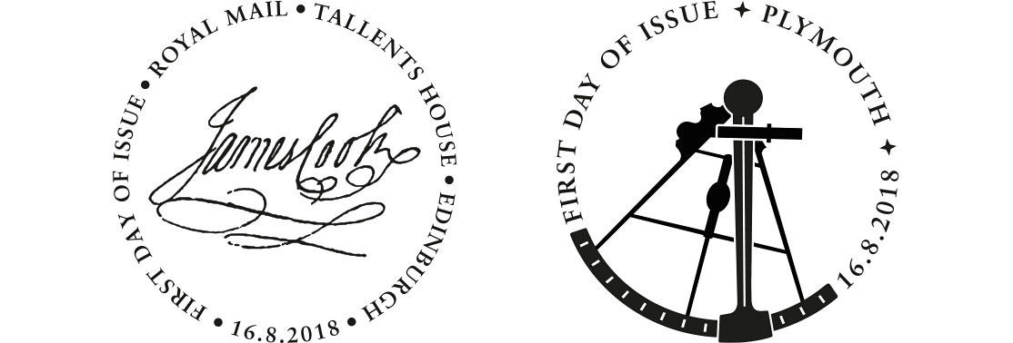
Captain Cook
To mark the 250th anniversary of Captain Cook setting sail on one of the greatest voyages of discovery of all time aboard HMS Endeavour, Royal Mail asked us to design a commemorative mini-sheet stamp set. The four stamp set illustrates the key locations from the voyage; a chart of the discoveries made by Captain James Cook; canoes on Raiatea, Society Islands; an arched rock with a Maori clifftop fort in New Zealand; and repairing the Endeavour on the Endeavour River, Australia. The background to the sheet shows hand-coloured engravings from A Journal of a Voyage to the South Seas (1794) by Scottish botanical illustrator Sydney Parkinson. Parkinson accompanied Captain Cook on the voyage and was the first European artist to visit Australia, New Zealand and Tahiti.
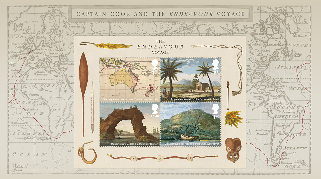
We also produced all the accompanying products for the set including presentation packs and First Day Cover envelopes and special postmarks. These take a more in-depth look at the discoveries during the three year voyage with information about the different lands, peoples, flora and fauna of the Pacific.
I’ve been fortunate to work with Webb & Webb on numerous projects for Royal Mail.
Each time, I am impressed by the creativity, enthusiasm, and knowledge that they bring
to a project. Their design solutions often surprise, and always deliver results
that showcase the passion they have for what they do.
Catharine Brandy, Design Manager, Royal Mail
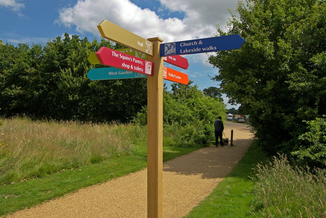
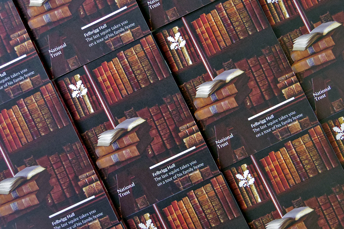
Felbrigg Hall
A complete overhaul of the visitor experience at Felbrigg Hall, including the creation of a comprehensive visual identity, signage, exhibition and product guidelines. Making the last squire the conduit through which the history of the property is told, we identified key areas, characters and stories. Bringing these together in a way that is unified, informative and unique to Felbrigg, we created a visual language system called Hall Marks.
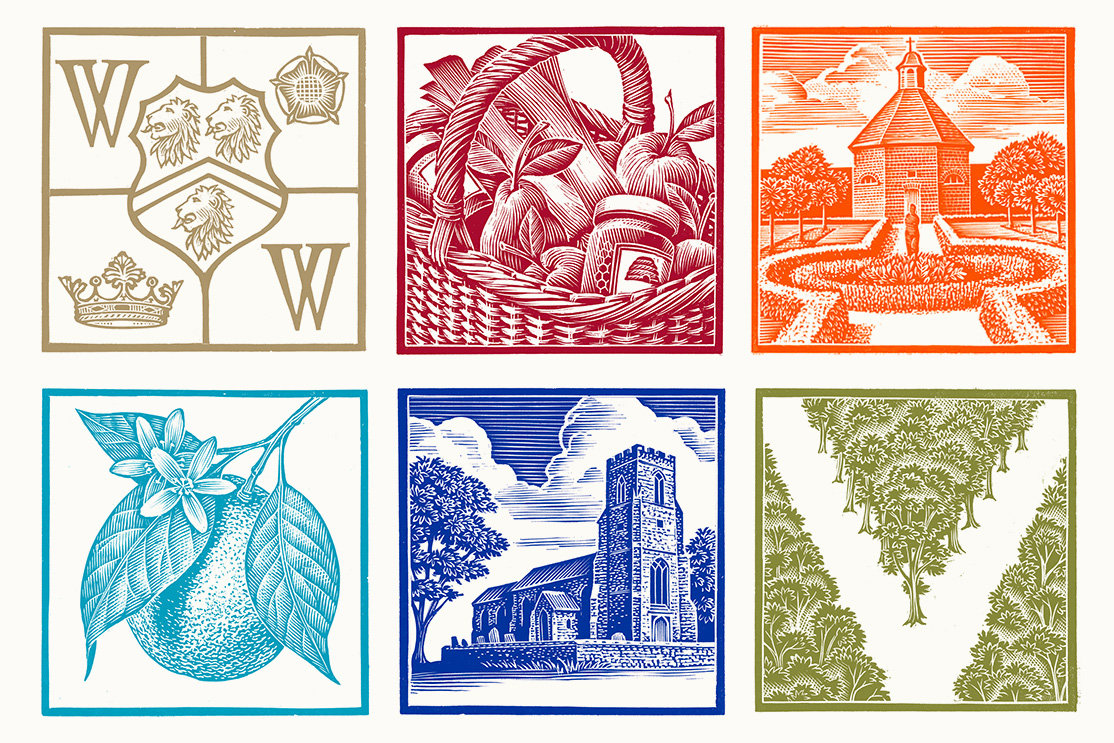
Hallmarks refer to distinguishing characters or traits and we created a set of icons and guidelines closely depicting what is distinct about Felbrigg. To bring our ideas to life we enlisted award-winning illustrator Andrew Davidson to cut a series of wood engravings depicting six visitor ‘zones’.
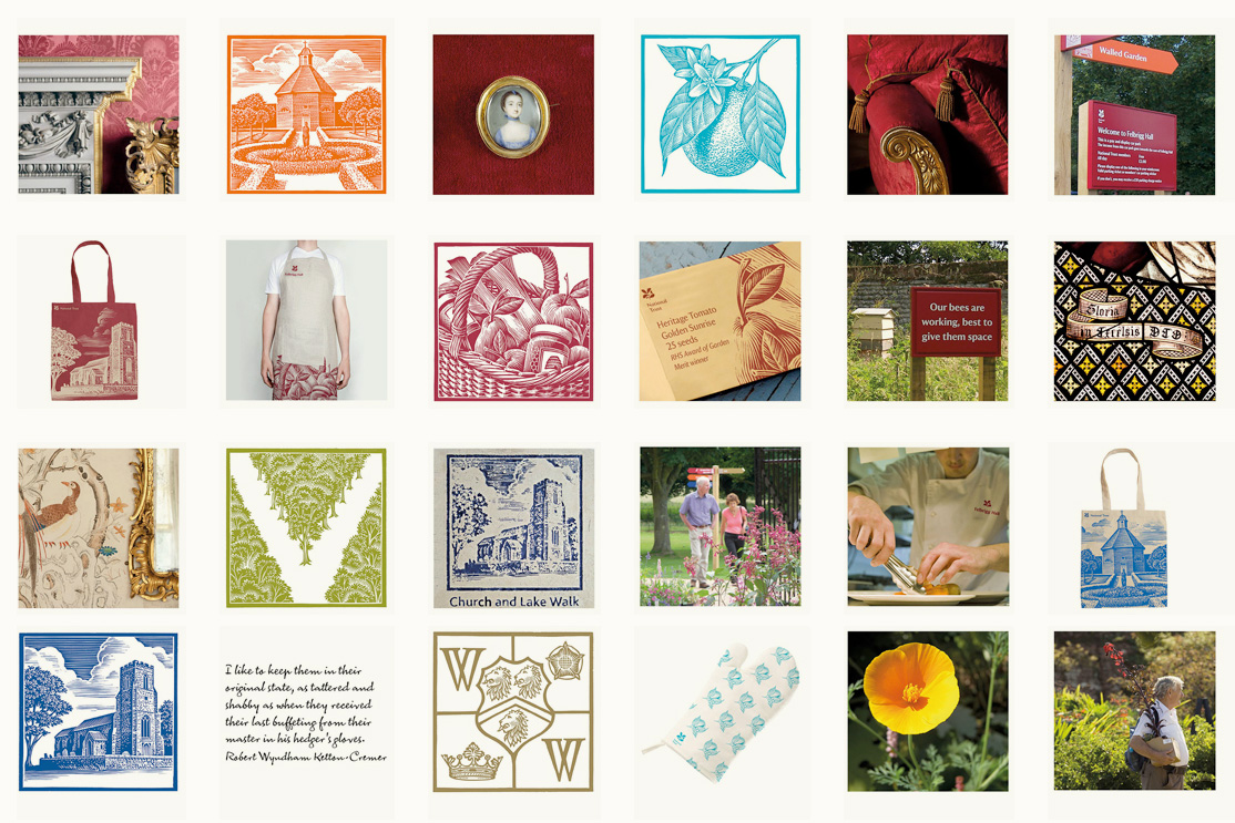
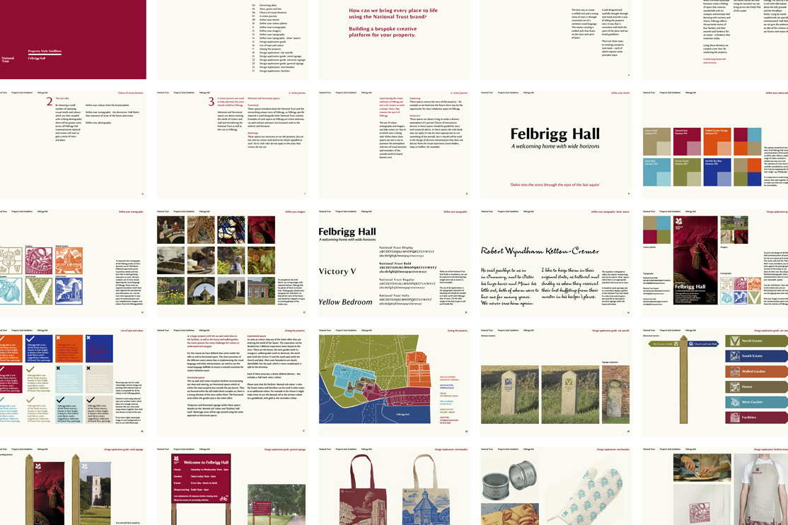
We also produced a complete estate wayfinding system, visitor experience materials, marketing communications and product designs. The project has resulted in a 20% increase in new and return visitors in the first nine months.
Webb & Webb understood intuitively what visual style was suitable
which alleviated much of the workload of the project team. The outcome
was extremely successful, demonstrably enhancing the visitor experience.
Victoria Bradley, Operations Manager, National Trust
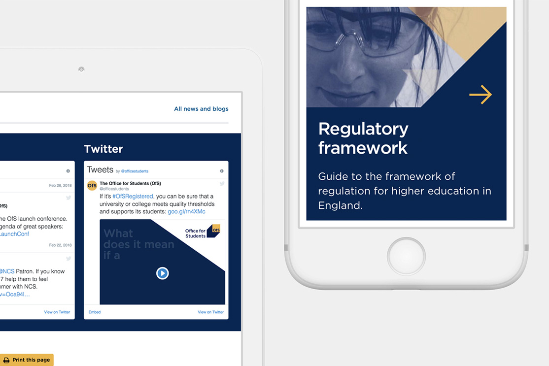
Office For Students
The Office for Students (OfS) is the new government-approved regulatory and competition authority for the higher education sector in England. With £3.6 billion in funding to allocate and two million students to oversee, a clear and consistent visual communication strategy was required across all platforms.
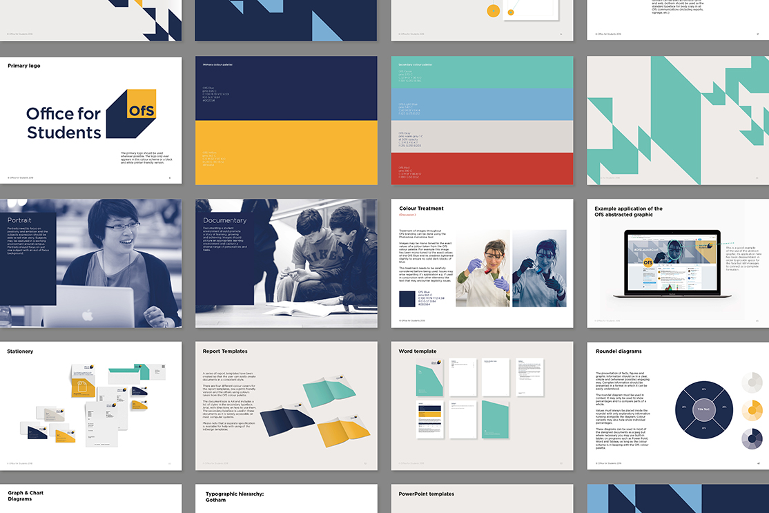
We developed a flexible system of imagery and overlaid graphics, strong enough to stand on their own in a simple report or integrate to create a more dynamic approach for documents presented to government and the media.
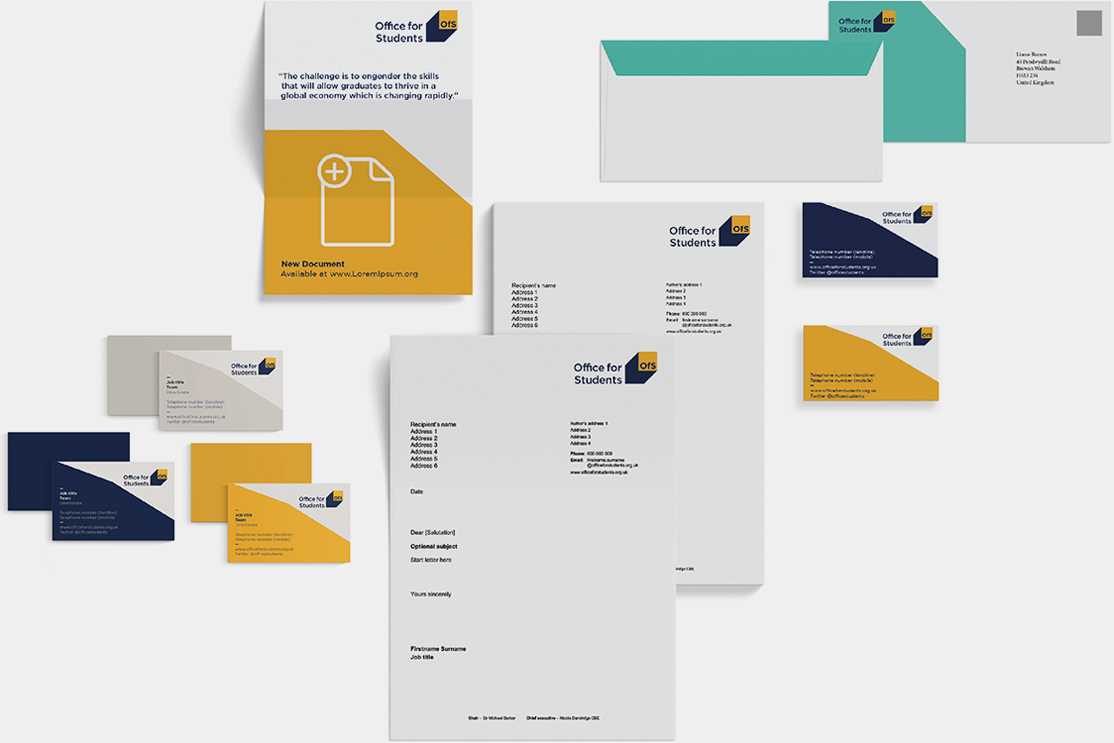
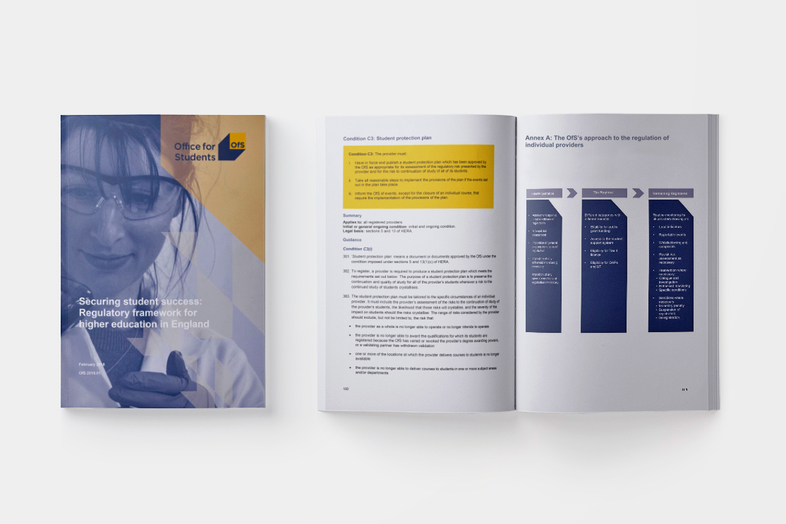
We also developed an entirely new iconography that helped bring the identity to life, advised on branding across all digital platforms, developed a photography framework and produced templates for all communication touch-points.
 May I take this opportunity to say a massive thank you to you for all your hard work
and positivity… I’m really looking forward to seeing how everything evolves.
Project Manager, Higher Education Reform Group
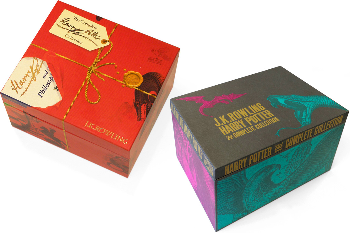
Harry Potter
J.K.Rowling’s Harry Potter had never had a series of co-ordinated covers until Bloomsbury asked us to redesign the series. We commissioned Clare Melinsky to create the lino-cut illustrations and created the Signature identity, which we imagined as Harry signing his name in the air with his wand.
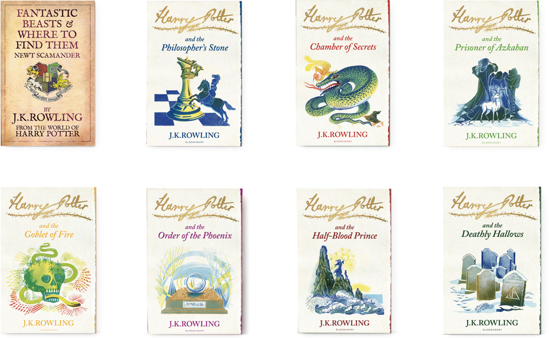
Later we were tasked to attract a new era of ‘mass market’ reader to the Harry Potter series. The brief was clear, to not only capture the spirit of the story but to stand out amongst the plethora of black photographic covers in the adult/teen fantasy market. The juxtaposition and sizing of J.K. Rowling’s name against the book title aims to portray Rowling as an author and not just the writer of the Harry Potter series. Having already designed the children’s ‘Signature’ edition using lino-cut illustration, we commissioned Andrew Davidson to use a more ‘adult’ wood-engraved approach.
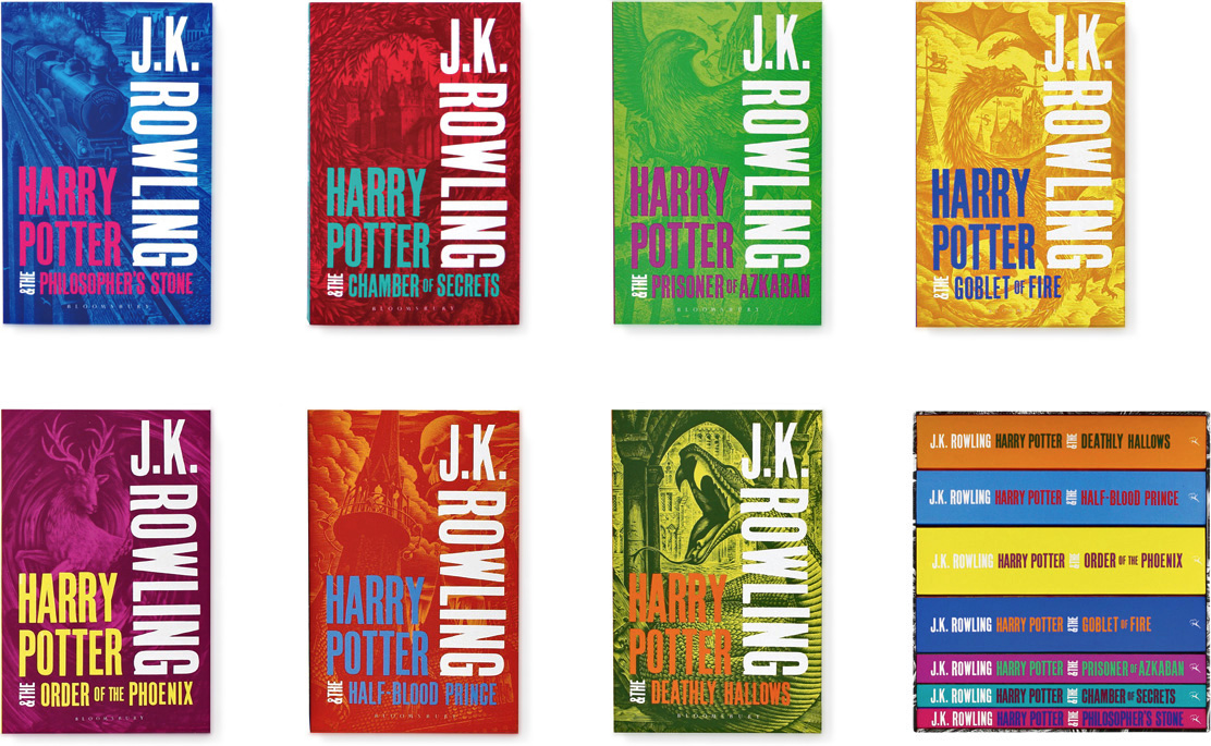
The highly successful paperback set led to Bloomsbury asking us to re-work the designs into a hardback edition set.
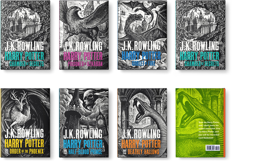
We also designed box-set packaging for all three editions, as well as marketing material and custom typefaces developed from the wood block cover type. The box-set for the Signature series, tied with golden string and labelled with our Harry Potter signature branding, appears to have been shredded by the delivery service – the publishers drew the line at owl droppings!
 I want these in posters!
They’d look wicked sweet in an English classroom or something!
Mugglenet.com