Harry Potter
Client: Bloomsbury Publishing
Twenty-two cover designs for the world's most famous wizard and the best-selling book series of all time.
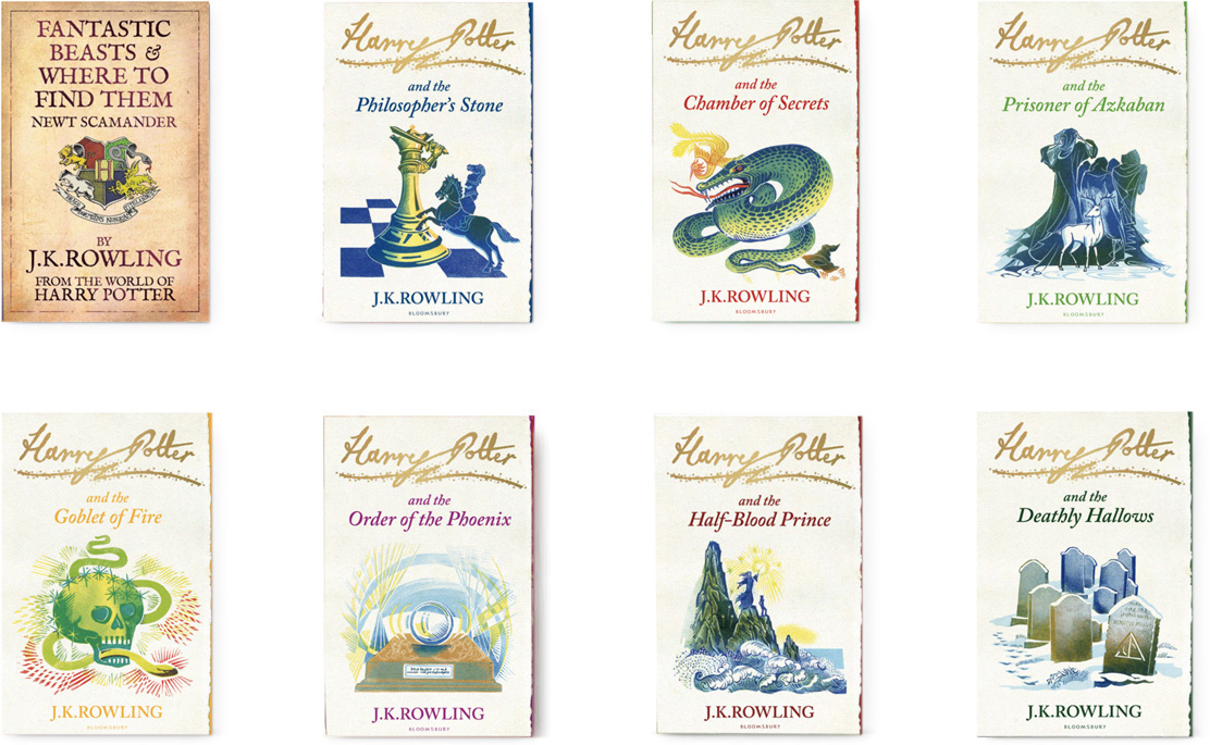
J.K.Rowling’s Harry Potter had never had a series of co-ordinated covers until Bloomsbury asked us to redesign the series. We commissioned Clare Melinsky to create the lino-cut illustrations and created the Signature identity, which we imagined as Harry signing his name in the air with his wand.
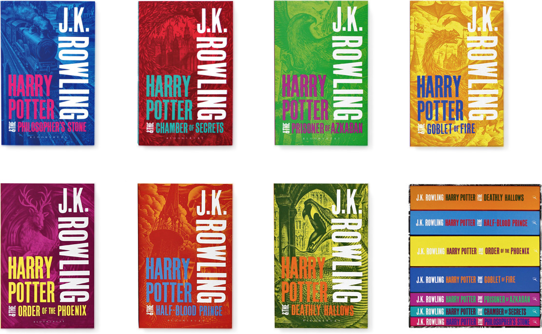
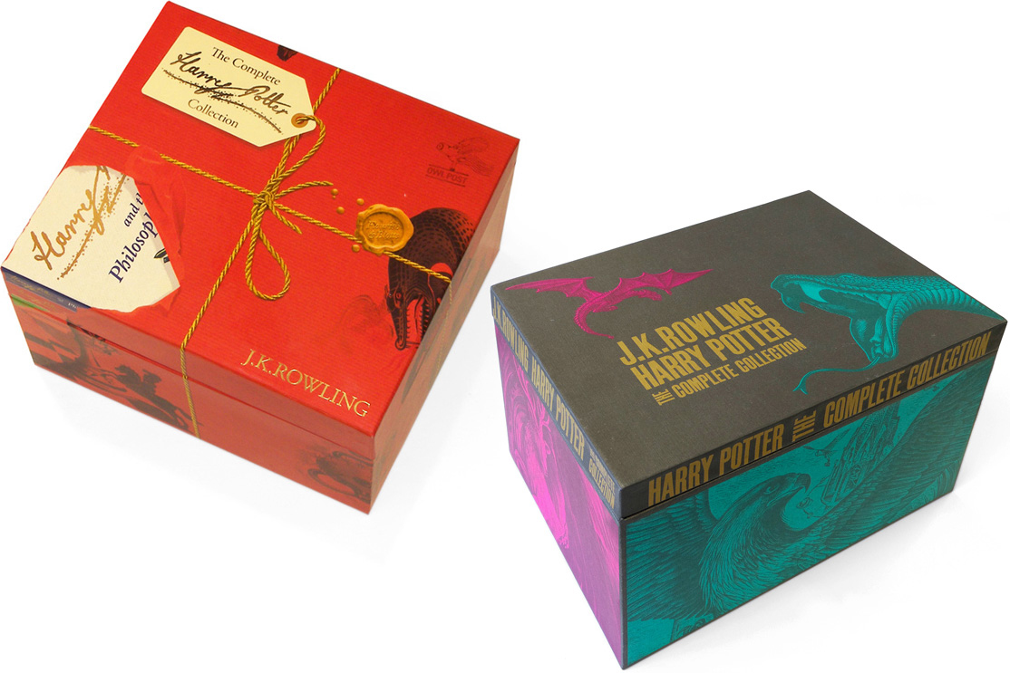
Later we were tasked to attract a new era of ‘mass market’ reader to the Harry Potter series. The brief was clear, to not only capture the spirit of the story but to stand out amongst the plethora of black photographic covers in the adult/teen fantasy market. The juxtaposition and sizing of J.K. Rowling’s name against the book title aims to portray Rowling as an author and not just the writer of the Harry Potter series. Having already designed the children’s ‘Signature’ edition using lino-cut illustration, we commissioned Andrew Davidson to use a more ‘adult’ wood-engraved approach.
The highly successful paperback set led to Bloomsbury asking us to re-work the designs into a hardback edition set.
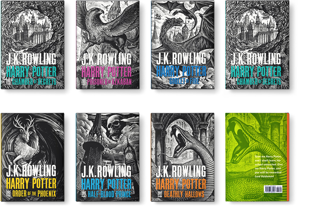
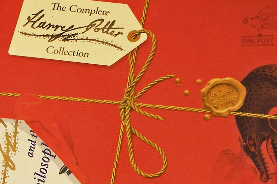
We also designed box-set packaging for all three editions, as well as marketing material and custom typefaces developed from the wood block cover type. The box-set for the Signature series, tied with golden string and labelled with our Harry Potter signature branding, appears to have been shredded by the delivery service – the publishers drew the line at owl droppings!
 I want these in posters!
They’d look wicked sweet in an English classroom or something!
Mugglenet.com